


1.1 Widget Setting
1.1.1 Data Tab
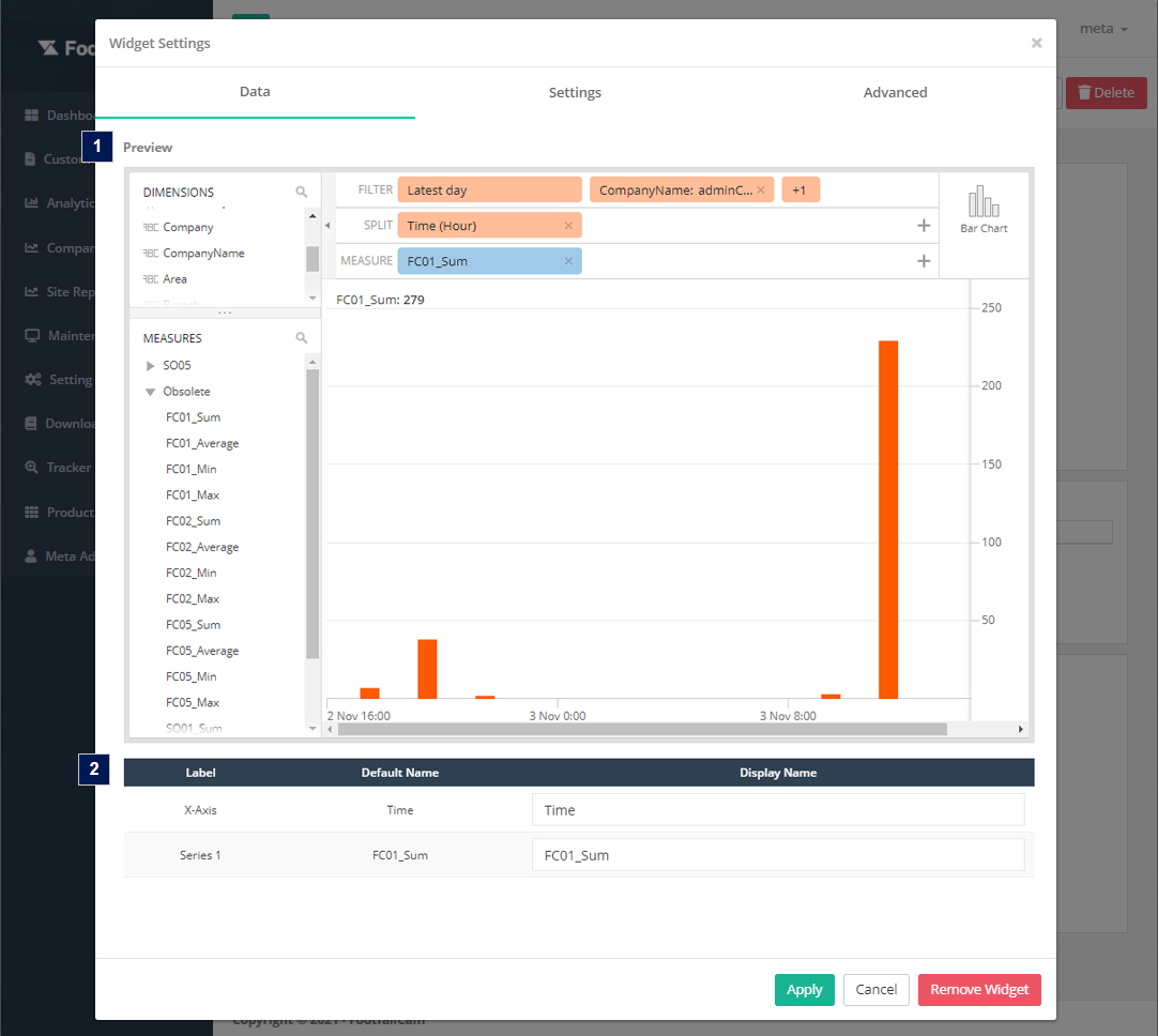
1.1.1.1 Preview
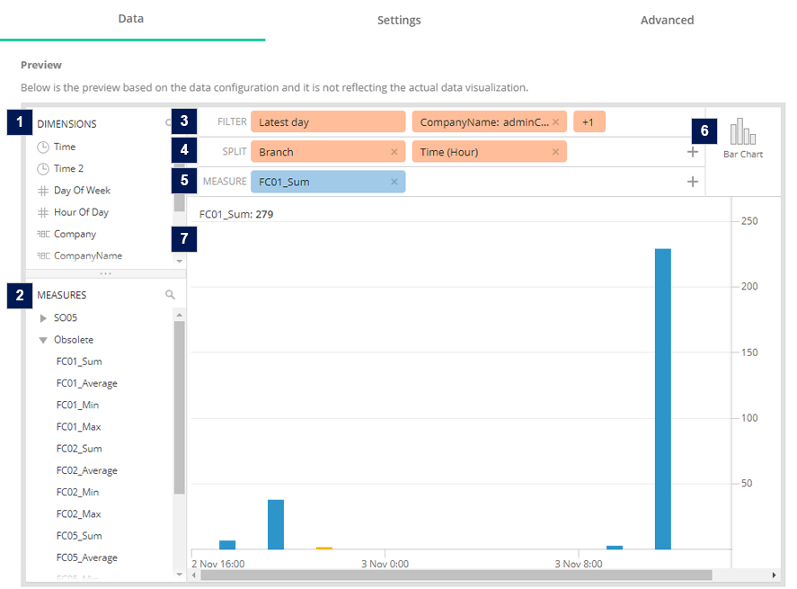
- Dimensions
- A list of dimensions. Users are able to drag the dimension to the Filter or Split area to render out the result for the graph.
- Measures
- A list of metrics. Measures are the values that will be aggregated over the selected data. Users are able to drag the metric to the Measure area to select the metric for the widget.
- The naming structure of measure: [Metric Code]_[Count Mode]_[Aggregation Formula] (e.g. FC01_1_Sum)
- For metric code definition, please refer to Appendix B - Metrics Definition
- The following count mode stand for:
- 1 - People,
- 11 - Visitor People,
- 21 - Staff People,
- 12 - Car Vehicle
- Filter
- Users are able to select the dimension to filter (WHERE clauses) the data for the graph. By default, the filter will follow the report granularity to preselect a few dimensions. (e.g. Company level report will auto filter with latest date, company id and company name). If users drag a non-preselected dimension (e.g. Area), this widget will become data binded and the graph output will follow the selected option of the dimensions.
- Filter Configuration:
Item Description 1. Time 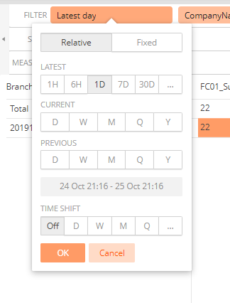
- Default filter date range based on the widget time interval.
- Minutes, 15Minutes, Hours - Latest Day
- Days - Latest Week
- Weeks - Latest Month
- Months, Quarter, Year - Latest Year
- Users are able to select the data range to preview the graph output. If user select relative time, the selected time will not apply to the real data for the graph to display (only for preview display purpose). If user select fixed time, the selected time will apply to the real data for the graph to display
- Time Shift - Users are able to compare a timeframe with a previous one. Users are able to define a shift interval such as last day, last week, last month or other ISO_8601 Duration Expressions (e.g. PT1H for one hour, P1Y for one year).
2. Data 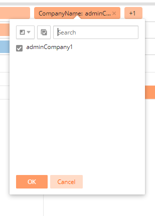 Users are able to select for the dimension options to preview the graph output. If there are extra filters (not preselect dimensions), this widget will be considered as data binded.
- For example, if the selected granularity of the report/dashboard is Site, the preselected dimension will be Company and Branch. If users drag a non-preselected dimension (e.g. Area), this widget will become data binded and the graph output will follow the selected option of the dimensions.
- Default filter date range based on the widget time interval.
- Split
- Users are able to select the dimension to split (GROUP BY clauses) the data for the graph. The maximum split for G02 bar chart widget are two dimensions, which are Time, Data, Data + Time or Data + Data.
- Split Configuration:
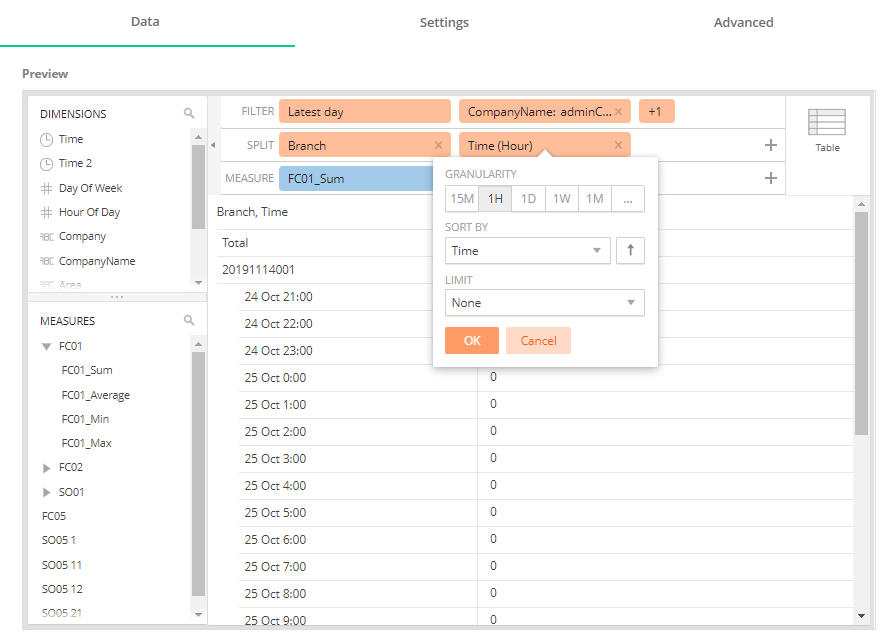
Item Description 1. Granularity (Only Supported for Time Dimension) - Time - Time Granularity based on the widget's time interval.
- Time2 - Users are able to select the granularity for Time, which are minute, hour, day, week, or month.
2. Sort By Sort according to the selected option. 3. Order By Order by ascending or descending. 3. Limits Select the output limit (5, 10, 25, 50 or 100).
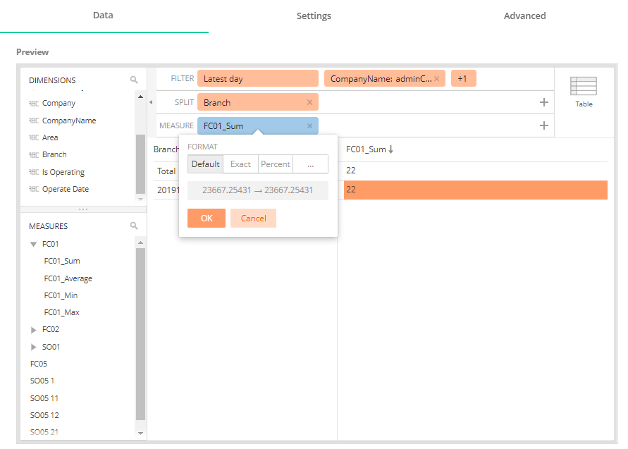
- Measure
- Users are able to select the measure to render the data for the graph.
- Users are able to select the measure to render the data for the graph.
- Element Type
- Preview the result in different element types (only for preview display purpose).
- Preview Screen
- Users are able to preview the graph output in different element types based on the selected dimensions and measure in filter section, split section and measure section.
1.1.1.2 Preview Table
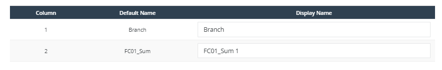
Users are able to configure the display name of the X-axis and Y- axis for the graph. By default, the display name will follow the default name of the selected dimensions/measures.
1.1.2 Settings Tab
| Item | Description |
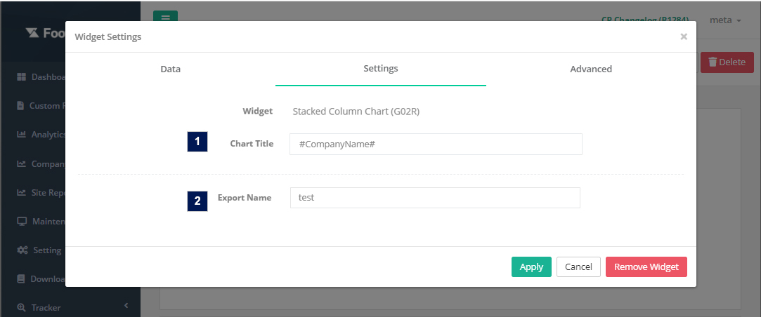
| 1. Chart Title* | Title for the table (Maximum 30 characters) |
| 2. Export Name* | Export name of the widget for the export function |
*Required field
1.1.3 Advanced Tab
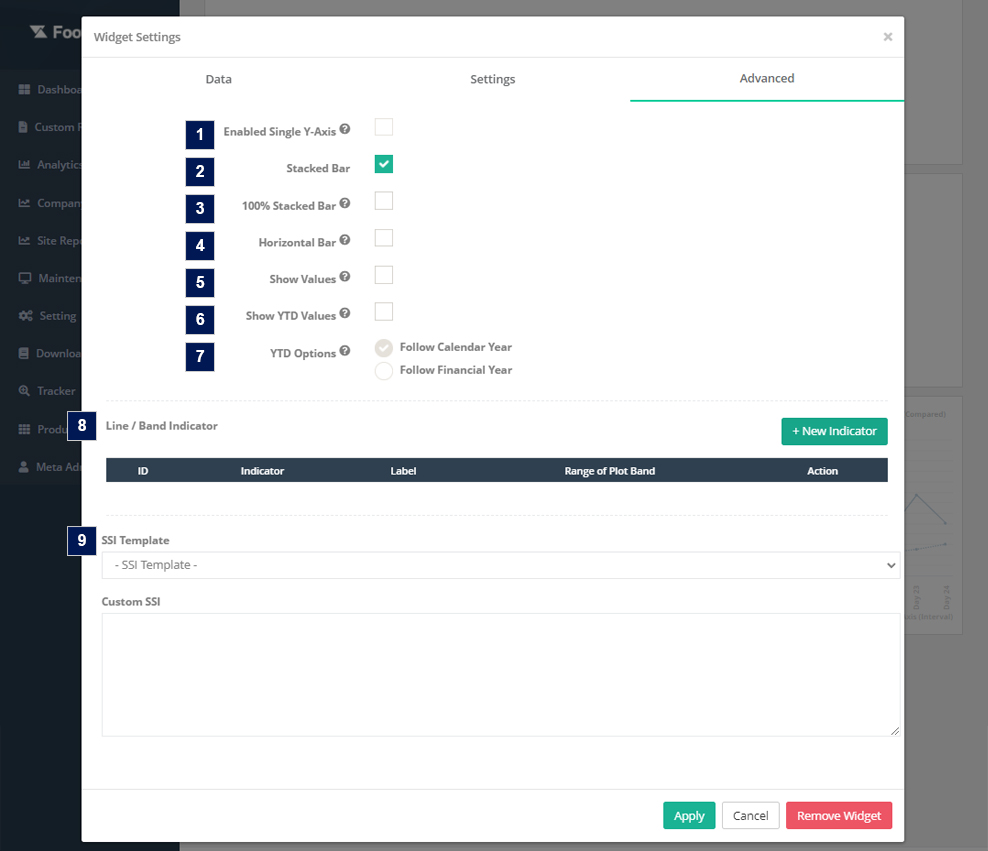
| Item | Description |
| 1. Enable Single Y- Axis | Check this checkbox to display multiple Y-axis as a single Y-axis. Only applicable for measures that have same data format |
| 2. Stacked Bar | By default, this checkbox is checked. Stacked bar is used to visualize data that accumulates to a sum. |
| 3. 100% Stacked Bar |
By default, the checkbox is unchecked. This checkbox is enable when there are multiple series or split by granularity level (e.g. Site, Area etc.) 100% stacked bar is used to visualize the relative percentage of multiple data series in stacked bars, where the total of each stacked bar always equals to 100%. (Note: 100% Stacked Bar not supported for Time Shift function) |
| 4. Horizontal Bar | By default, this checkbox is unchecked. This is to visualize the graph data horizontally. |
| 5. Show Values | By default, this checkbox is unchecked. This is to show the data value on top of each bar. |
| 6. Show YTD | Check this checkbox if the graph need to display date according to the period of the time beginning the first day of the current calendar year or financial year up to the current date |
| 7. YTD Option | Select the Year to date(YTD) format. By default, Calendar Year will be selected. Calendar year is a one-year period that begins on 1st of January and ends on 31st of December. Financial year is a one-year period that begins on the start date of the financial year as configured in the company settings |
| 8. Line/Band Indicator |
Note: Before configure line or band indicator, make sure the measure/metric selected for this widget has a metric definition and metric threshold value. Line indicator
Band indicator
|
| 9. SSI (Optional) | Apply custom SSI code by selecting the SSI template or enter the code in the text area. |